Rose Graphics
The Process – Designing the logo for Rose Graphics was a creative journey focused on building a brand identity that feels clean, modern, and subtly artistic. Each step prioritized simplicity and visual appeal, resulting in a logo that reflects the company’s professional yet imaginative spirit.
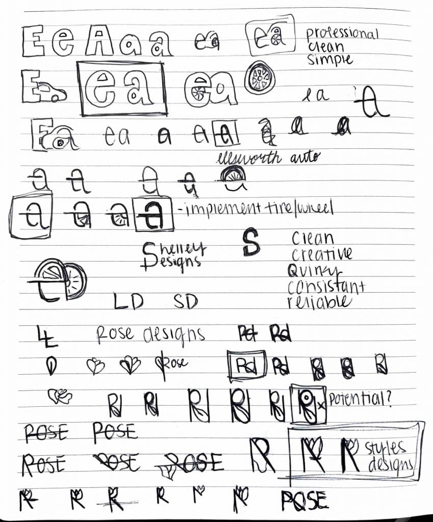
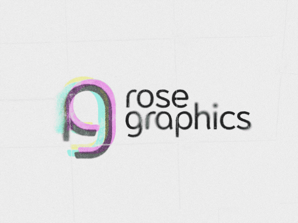
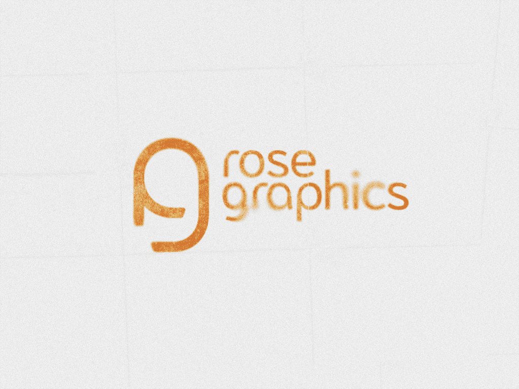
For concept development, I explored various forms and symbols that could represent “rose” in a subtle, non-literal way. The aim was to integrate floral elements with refinement and minimalism, achieving a balance between modernity and creative expression.

Refining
Moving to digital form. Once the initial designs were complete, I presented several options for feedback. This phase involved refining details—adjusting line thickness, spacing, and proportions—to ensure the final logo was balanced and visually cohesive. The feedback process allowed for collaborative input, ensuring that the design aligned with Rose Graphics’ vision and aesthetic goals.

Final Result
The final logo design embodies a clean, modern, and understated elegance, achieving a balance of simplicity and creative nuance. With its versatile and timeless appeal, the logo captures the essence of Rose Graphics, positioning the brand with a distinct, memorable visual identity.


